After long hours of tests and codings in multiple devices, we’re finally releasing our latest redesign to our own website. Considering that the last time we did this was back in 2008, so yes, it’s been a while.
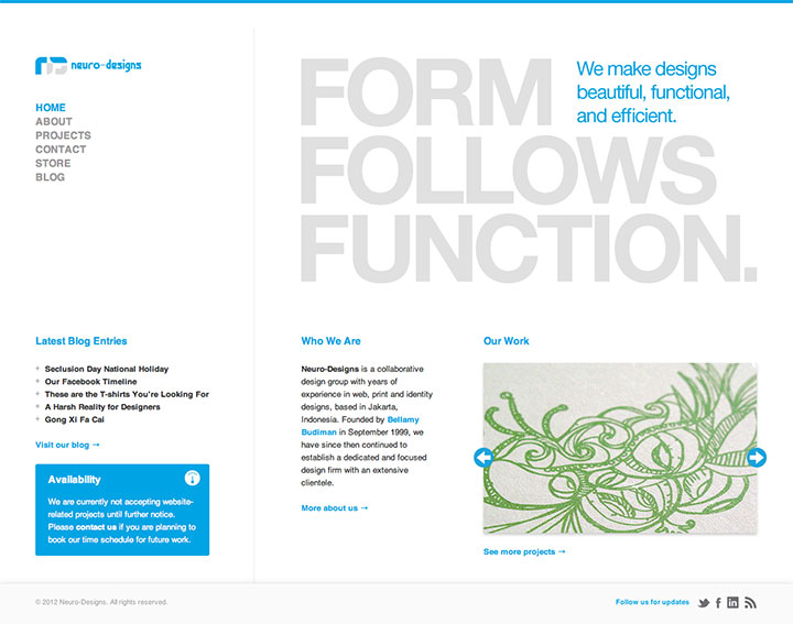
So what are the new features about this site? Well, there are a couple of huge things that we did. First of all, we are now basing the design on the 1280×1024 resolution, so that gives us a bit more room to showcase our work.
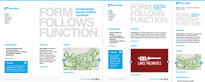
Second, yes, it’s finally a responsive website! Go ahead, you can try resizing your browser window and see the website resize in real time, and you can open the website on most, if not all, modern mobile devices.
We know that as probably with all things digital, improvements are bound to happen. For example, probably not all of the graphics in our website are mobile-optimized, and they won’t be supporting the new iPad’s crisp Retina Display until we can get a hold of the device ourselves. Releasing out a new website doesn’t mean that we can push out new features without getting worried that bugs don’t exist.
So what’s next for us in terms of designing websites? Now we can use our website as a test bed for our clients should they decide to create responsive versions of their websites, and hopefully, we can phase out our aging mobile website. We won’t be needing it anymore with our main website now being responsive.