Blog

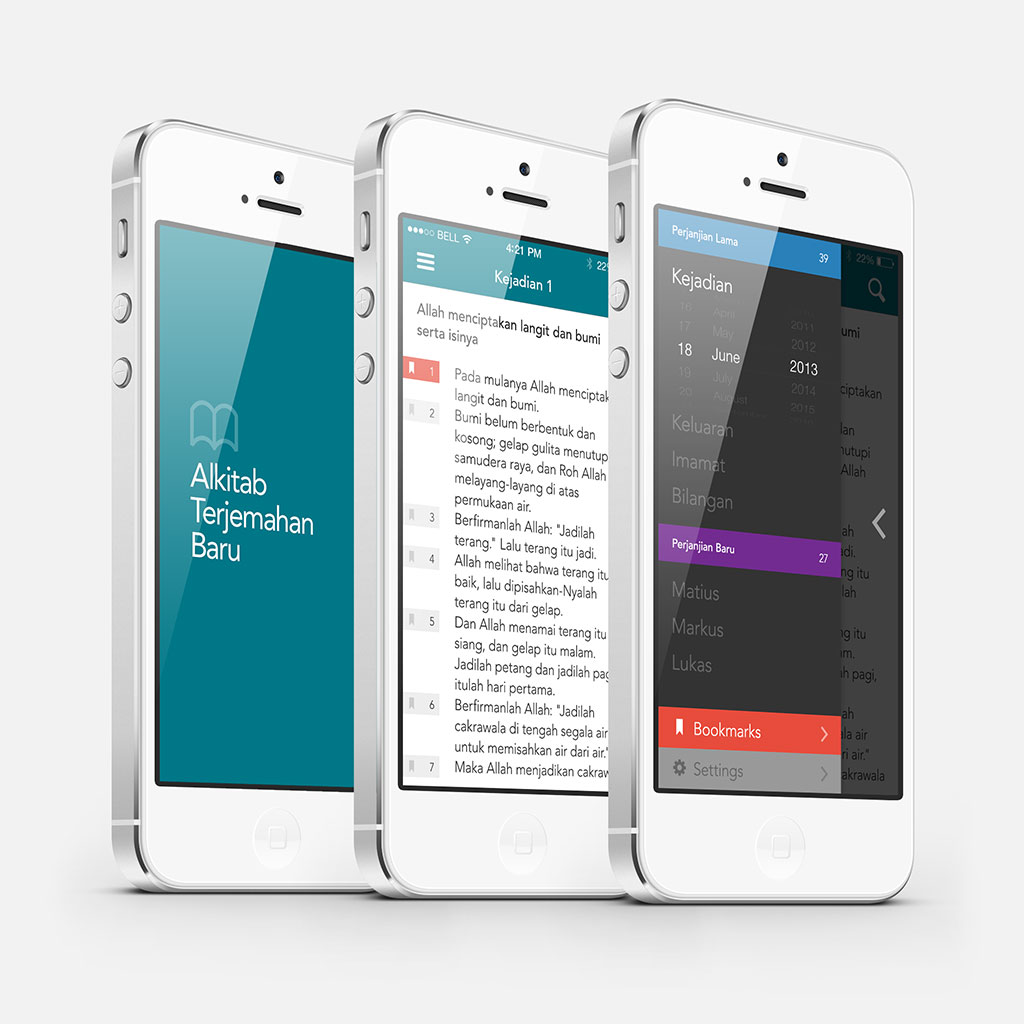
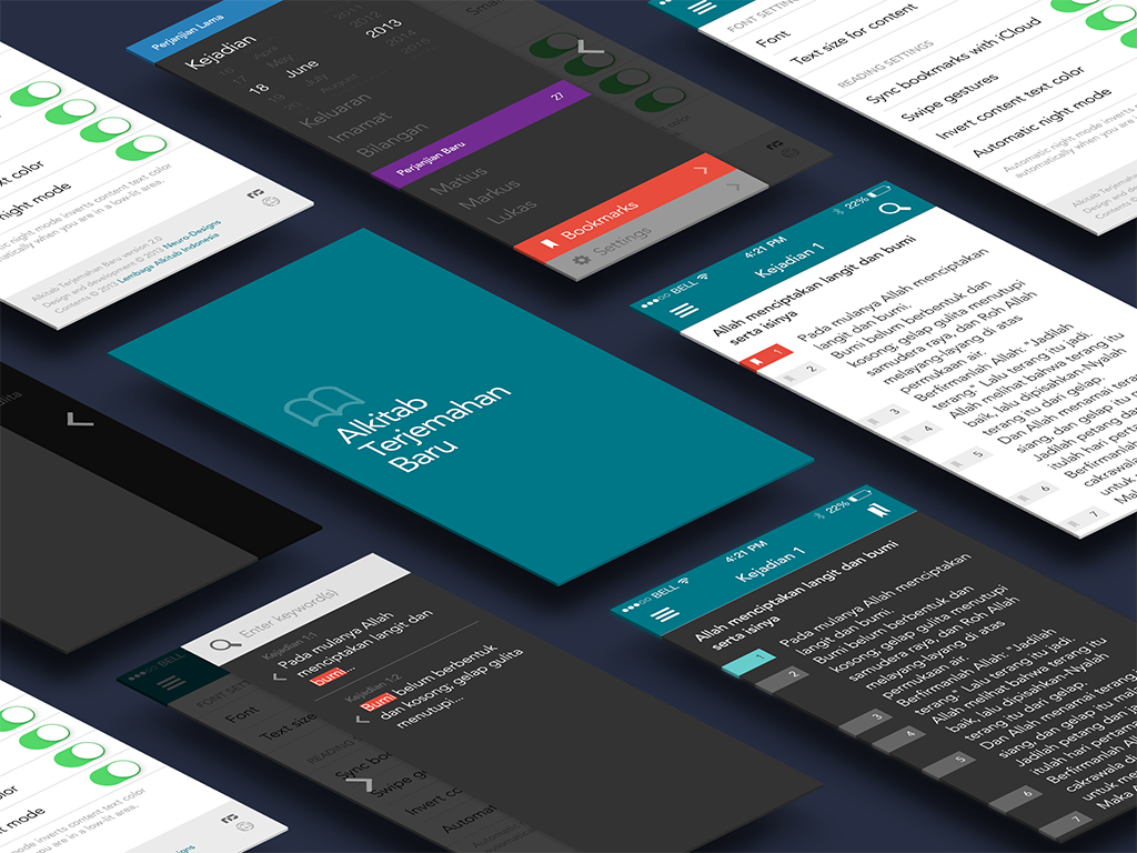
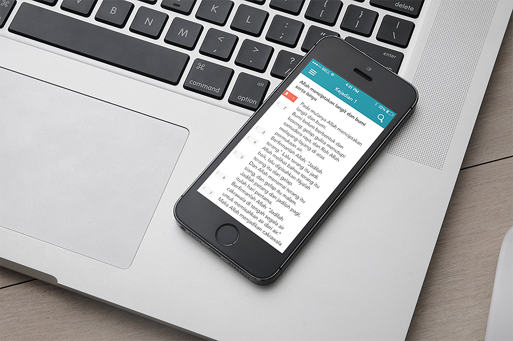
After four years since its inception, we have decided to discontinue our Alkitab Terjemahan Baru app. This app has been a pet project for us for many years, and while we have prepared the designs for the next version, unfortunately we never have the resources required to fully dedicate ourselves in this project. Instead of keeping a half-baked product that was initially conceived for iOS 3, we have removed the app from its availability in the App Store.

If you’re looking for a replacement app, the Bible app from YouVersion is a very good choice as it has numerous features, constant updates, and multilingual bible downloads. If you need a full-featured bible for the iPhone, this is the go to app.

As for the Alkitab Terjemahan Baru 2.0, we’re going to store the project in our vault, and who knows, maybe one day we get to continue where we left. Right now, the screenshots and mockups will be here as a token of things that could’ve come.

Alkitab Terjemahan Baru - Product Mockup

Alkitab Terjemahan Baru - Isometric App Mockup

Alkitab Terjemahan Baru - Real Life Mockup


Redesigned Store

Since the last time we redesigned our website, we have been working hard bringing the Store back by looking at the simplest way to do things. You can see the results here.

We never planned to have the most sophisticated shopping cart in the world as that would be redundant for the workflow we’re looking for, and we’re also designers first and storekeepers second. Right now we’re just looking for the fastest way to get our limited products to you, and I think our current setup works.

We also know that we haven’t exactly been too productive on the store front, but rest assured, hopefully this year, we will have new products coming.


Neuro-Designs

FINALLY! That is probably the first thing that came into our minds when we published our brand new website today. It has been almost two years since we did our last redesign, we did had quite a few handful of projects and responsibilities late last year, and this version has been sitting in the test server way too long.

As you probably guessed, we are fans of simplicity, so while the last website was perfectly fine, we figured that we can continuously improve our home. With this new site, we enhanced the usability, simplified and optimized the design in all possible devices that we could get our hands on, threw away a few things that we didn’t actually use, and we loved how it looks. However, this really is version ten point zero, so it probably has a few bugs here and there that we need to sort out.

You might notice that the Store is gone. Well, no, but we’re still figuring out a way to simplify it for now. If you need to buy old T-shirts from our stock, you can still head over to the previous store.

So there you go. We hope you enjoy our new site as much as we do.

Update: Our store is back online, click here to go there.


EzyTravel

Earlier this year, we were commissioned by EzyTravel to rejuvenate their web presence into something cleaner, more modern, and most importantly, easier to use. Our work starts off with simple wireframes, cutting away unnecessary steps and contents, to further streamline the most essential functions of the website. Above is the screenshot of our proposed design, which was then passed on to their development team for implementation.

EzyTravel Mobile

We also helped them realize an updated design for their website’s mobile version. One of the biggest hurdles in the design is that it has to stay similar across multiple mobile devices, while keeping all the required functions intact and making sure that the user experience, while adapted for mobile use, stays as similar as possible with the desktop version.

Disclaimer:
Our scope of work only covered the design stage. Actual implementations are subject to modifications and may result in a slightly different direction from the designs above.


mbaMission

After a few months of intensive development, mbaMission launches their new website we helped redesigned. The approach of this redesign has been a departure from the old mbaMission website, gone are the cramped and outdated design, the ubiquitous layout, and the predictable configuration. This new website gives mbaMission a new face, emphasizing the firm as one of the best MBA admissions consulting firms available online. The new website also features individual consultant profiles that give their clients–and potential clients–a friendlier facade rather than just paragraphs of text.

mbaMission has been one of Neuro-Designs’ oldest clients, and for us, this redesign has been one of the best benchmarks on how a partnership between a design firm and a client could complement each other.