Some time ago, a few people asked us on why we make our T-shirts in a short-run production. Why not make them into a commodity or market them through store chains and local distro shops? To be honest, that thought crossed our minds a couple of years ago, but we do have some good reasons for not doing so.
Reason #1: We Like to Keep Them Exclusive
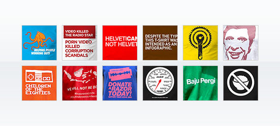
While many would probably disagree with us, we think that exclusivity is important to define who we are and what we designed. In terms of quality, even when we jumped in to the same meme bandwagon and created a T-shirt out of it—The Trololo T-shirt, for example—we always wanted to take the design from another edge, differentiating from others who made T-shirts with the same exact theme.
In terms of quantity, it goes even better. Limited number of copies of our T-shirt design means there are less people wearing it. This gives our design a step further from ubiquity.
Reason #2: Apparels for a Niche Market
If some people thought that we didn’t try to market our T-shirts at a local and popular trade forum, we did. In fact we did that recently and we didn’t like the results. It turned out that not everyone out there have the same thought or taste like ours. Some people just don’t get our designs, some people just didn’t like it, and to make matters worse, some people even defined our designs as something that is too sterile and that it lacks “design” elements. It’s rather hilarious since we never aimed our designs to be something like Ed Hardy, which we’re sure that they are attractive for some people.
Our T-shirt designs are based on things that we cannot express when we are designing for our clients. Some of them are extensions of memes, fiascos or popular culture that we think consider important to be immortalized into something that we can wear every day.
So instead of giving what everybody wants and reduce our passion in apparel design, we’d rather cater those who share the same thoughts and can appreciate our designs as they are. It’s just a simple fact that you can’t make everybody happy.
It seems that we’re quite happy with how things are going now with our T-shirt designs, and besides, since this is not our primary industry, we’re just trying to have some fun while we’re at it :)